Tuesday, March 26, 2019

Audience Profile

Tuesday 26th March 2019
Coursework Lesson Five; Audience Profile
Do Now

In this task i will create a survey based on what my magazine will be about to use that information in the creation of my magazine.


- In this lesson i created my survey and it was sent out to my class to be answered and reviewed by next week.

Intertextuality in Media Research

Tuesday 26th March 2019
Coursework Lesson Four; Intertextuality in Media Research
Do Now

In this task i will choose 3 different media texts and link them with an explanation to Intertextuality and what effect it has in their intended audiences.


1.

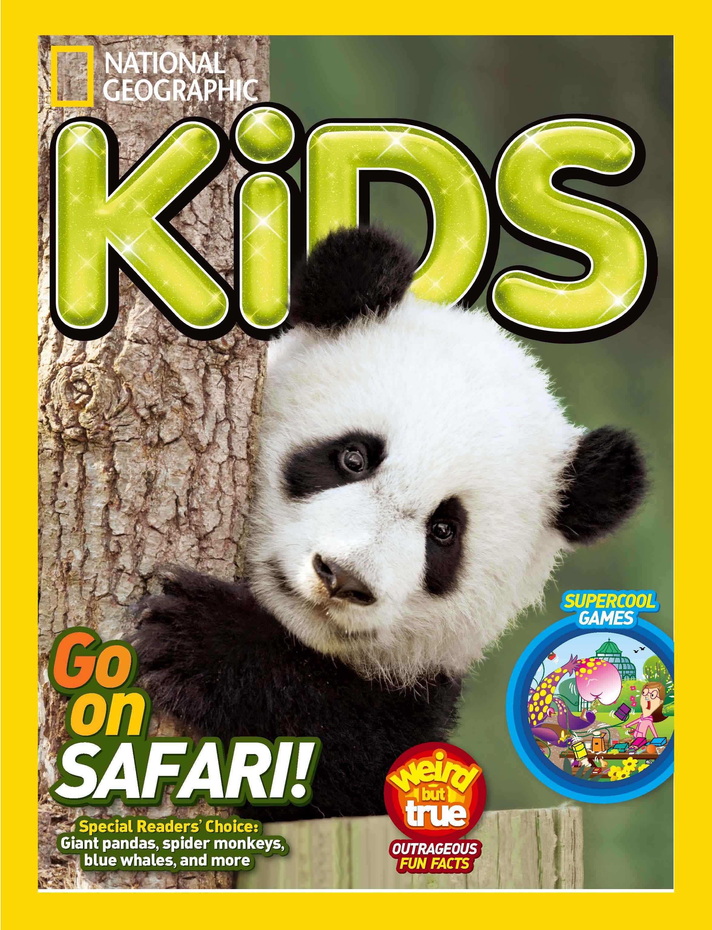
Image result for national geographic kids
This shows intertextuality in media because the national geographic magazines no matter if its the kids version or the teens version, there will be a yellow border outlining the details in the middle as that is the logo which national geographic has and that's why if you see a magazine in a shop with a bright, bold and yellow border you will already know that, that is simply a national geographic magazine but if you take a closer look you will then be able to tell what age group it has been specified for. But, i have also noticed about this magazine that as it is a kid friendly magazine its cover features a young panda (that is probably also a child) and that is why the young panda was chosen for the cover of the national geographic magazine that is aimed at young kids.

2.

Image result for the big issue ghostbusters
This shows intertextuality in media because it shows that women are coming to power more whilst stating it in a way which portrays humor. The way it shows this is by the use of the new Ghostbusters movie in which the ghostbusters are female that shows power and proves that women can do just as well as men in the same job which has a double meaning that we know because each of the women on the cover have done something or have taken a males job or worked the same position and maybe achieved more overtime and the new movie's main characters who were originally male have also been replaced by women to show power and new authority.This shows that women are becoming much more influential on the products we buy as they are being advertised as, as strong as men; through the simple caption/ movie quote and choice of movie poster for the use of a basic at first sight magazine. Also, at first it seems like this hilarious magazine is only a joke aimed at anyone to make them laugh but in reality it shows a deep hidden meaning that is aimed at young women all across the world probably around 15 and over.

Tuesday, March 19, 2019

Media Language and Representations in Media

Tuesday 19th March 2019
Coursework Lesson Three; Media Language and Representations in Media
Do Now

In this task i will choose examples of media magazines related to education and will analyse what i see and what i think of it in reference to my title.


(The images wouldn't save)


1.

This layout is quite basic and doesn't have any stand out features only a couple of links to the context inside. It does have a yellow distinctive border which makes it look bright and therefore catch the public's eye but its too plain and boring. Just by looking at it you can see that its most likely an art based magazine. The title is barely visible because it clashes with the image on the front cover. I think that the image takes up too much space and overpowers any of the writing on the cover and i think that even though there is very little on the page it looks as if there is too much. But the font also contradicts to this because its very small and barely readable.

2.
This cover by the same company but is much more developed and in a way advanced and what was done with makes it much more interesting and appealing to the audience. For example where the explosion caused by the planets' collision overlaps the title but leaves most of it untouched just so that its readable makes the article different to those around it and in this case the bright yellow border makes what is happening inside the border in a way contained and this gives much more effect to the whole outcome of the product. But once again although in this case the lack of writing and yet small font suit the whole image i feel like there is a lack of perspective causing the writing to be just a sort of irrelevant looking addition that is there because it needs to be not because it looks good. I think that if there would be more perspective on the planets then the font and writing could be arranged to suit the whole cover more.

3.

I don't like this double page spread because i feel like the whole thing is just way too colourful and the fonts are barely readable due to the whole situation and distraction going on all over the two pages. I feel like its simply too much to take in at once but as it is a children's magazine it does suit the checklist for the maturity of the magazine but i don't think its suitable for anyone over 10 but the content probably won't interest children below 10. The theme idea is good but i think that the design just went a bit downhill and stereotyped that everything for young teens and kids has to be bright and colourful.

4.

This magazine is just too much and too little at the same time because everything just doesn't flow together and its just plain. The photo is too large scale for the amount of writing there is on the page and i think that for the large image is sight captivating but for the wrong reasons. ,Maybe the large scale title in such a small space for writing is also the reason why the actual writing itself is simply to small and compacted into one area. I think the image should have been kept within the a4 range not over two pages as it just looks like the whole article is just an image with some claustrophobic writing. I think that its to simple, plain and basic so not on a high standard.

Tuesday, March 12, 2019

Plan

Tuesday 12th March 2019
Coursework Lesson Two; Plan
Do Now

In this task i will discuss my ideas for the NEA Brief i have chosen.


Idea


For my idea i was thinking of educating people about fashion. But precisely about the way that we shouldn't wear what we feel uncomfortable in but think we look good in to suit other people and their liking. My aim is to show people that you are most you when you feel like yourself not like someone who you are not. I want to show others that we are all different and we are not truly ourselves if we imitate people as no matter how much you would tell yourself that for example a style you copied from someone else is what you thought of it won't be the truth. I want to reach out to all of those who think they are going to be judged for being themselves and to all of those who lack confidence or those who feel they have to be someone else to be liked and accepted among friends in school or those who you want to be friends with.


I also feel that i for one am pretty confident in wearing what i like and not being who i am not in the clothes that i wear that's also why i feel like i should help others become more accepting with themselves and their styles. Another reason why i feel like this is what i should write about and do my magazine about is mainly because of my style and how it changed. This is because i have realised that as i have become older my style has changed a lot. Through year 7 my style was basic and plain and i only wore it because it made me fit in with others and i didn't want to be judged for what i wore. As year 8 started to come to an end and year 9 begun i realised that those who judged me had nothing to judge me about. In other words i became more confident. And this is something i want others to understand and become more confident in. So, i would want my magazine to be tips and ways to give people advice on how to be themselves and maybe tips on how to wear different clothes together.

Tuesday, March 5, 2019

NEA Briefs

Tuesday 05th March 2019
Coursework Lesson One; NEA Briefs
Do Now

In this task i will choose an NEA Brief and explain my choice.


1. I chose Brief One because as its an educational magazine i think it would be simple to think of an idea but more difficult to adapt it as educational and stick with the checklist but I'm willing to give it a go as i already have a couple ideas. Also, writing a magazine would be challenging in the Photoshop wise-way and as i already know a few part i don't think that it would be a huge challenge to learn how to properly use Photoshop as it would be expanding my knowledge and that can really help me. Whilst I work through the coursework i feel that i will learn more how to step out of my comfort zone and start thinking outside of the box which will hopefully let me be more free and in a way help and allow me improve my work.